Bittercube case study
Bittercube
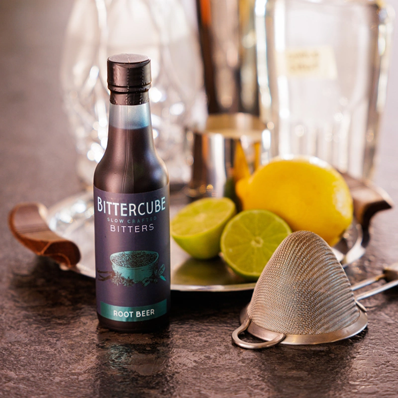
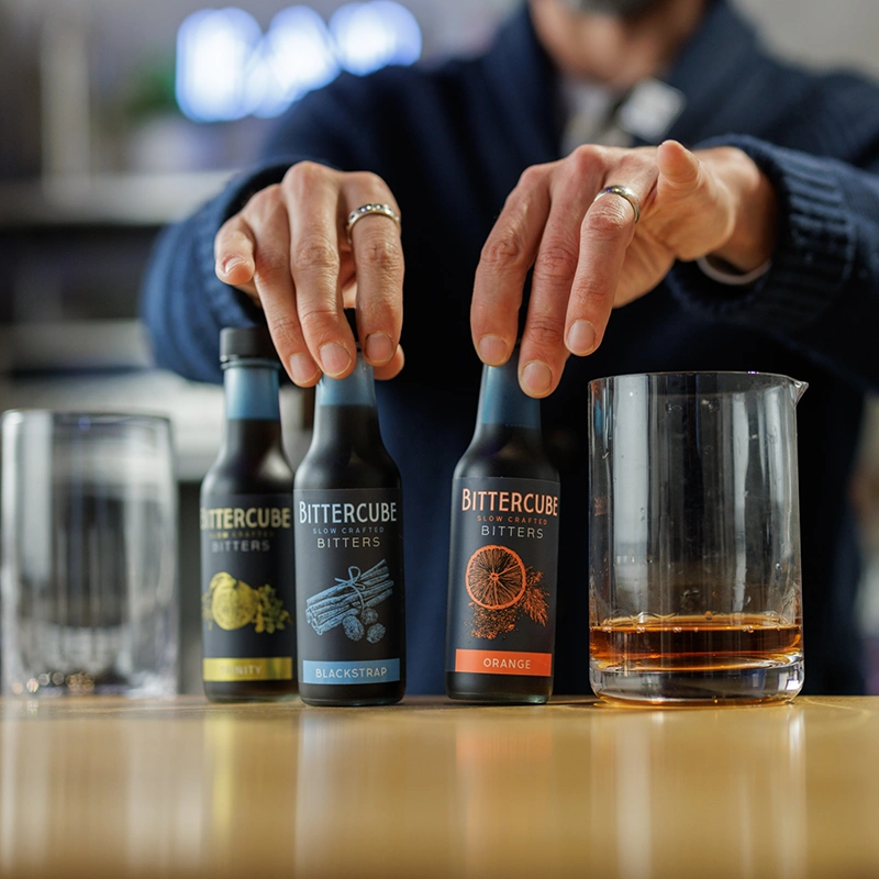
We love bringing Bittercube to discerning cocktail-makers, from foundational brand identity to the tiniest drops and dashes of style.
Services
Brand Refresh
As a longstanding strategic partner, we've supported Bittercube in everything from a total rebrand to business development.
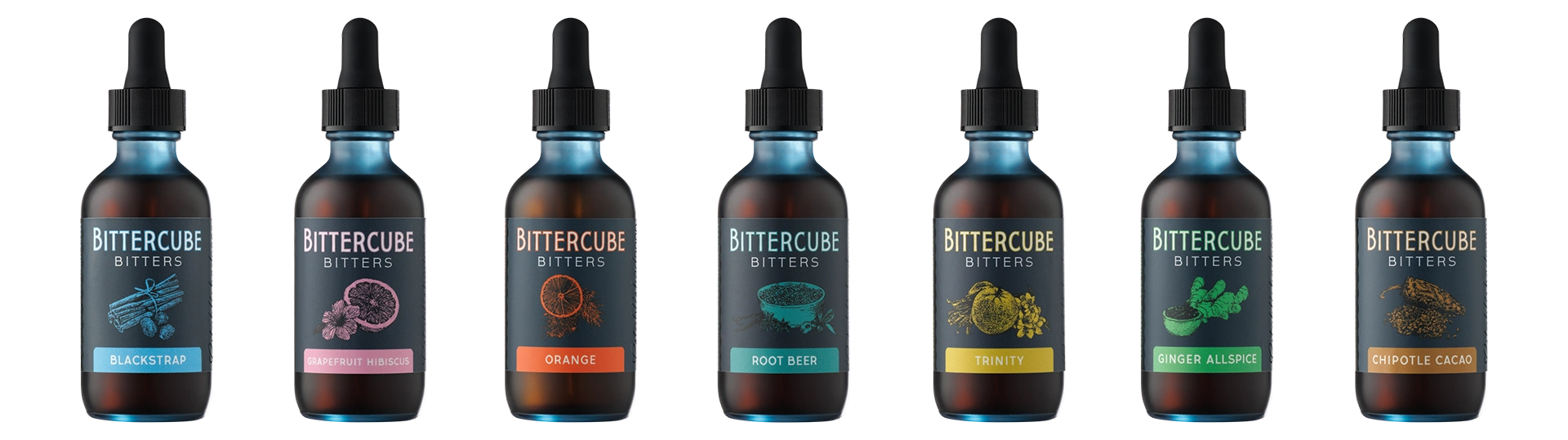
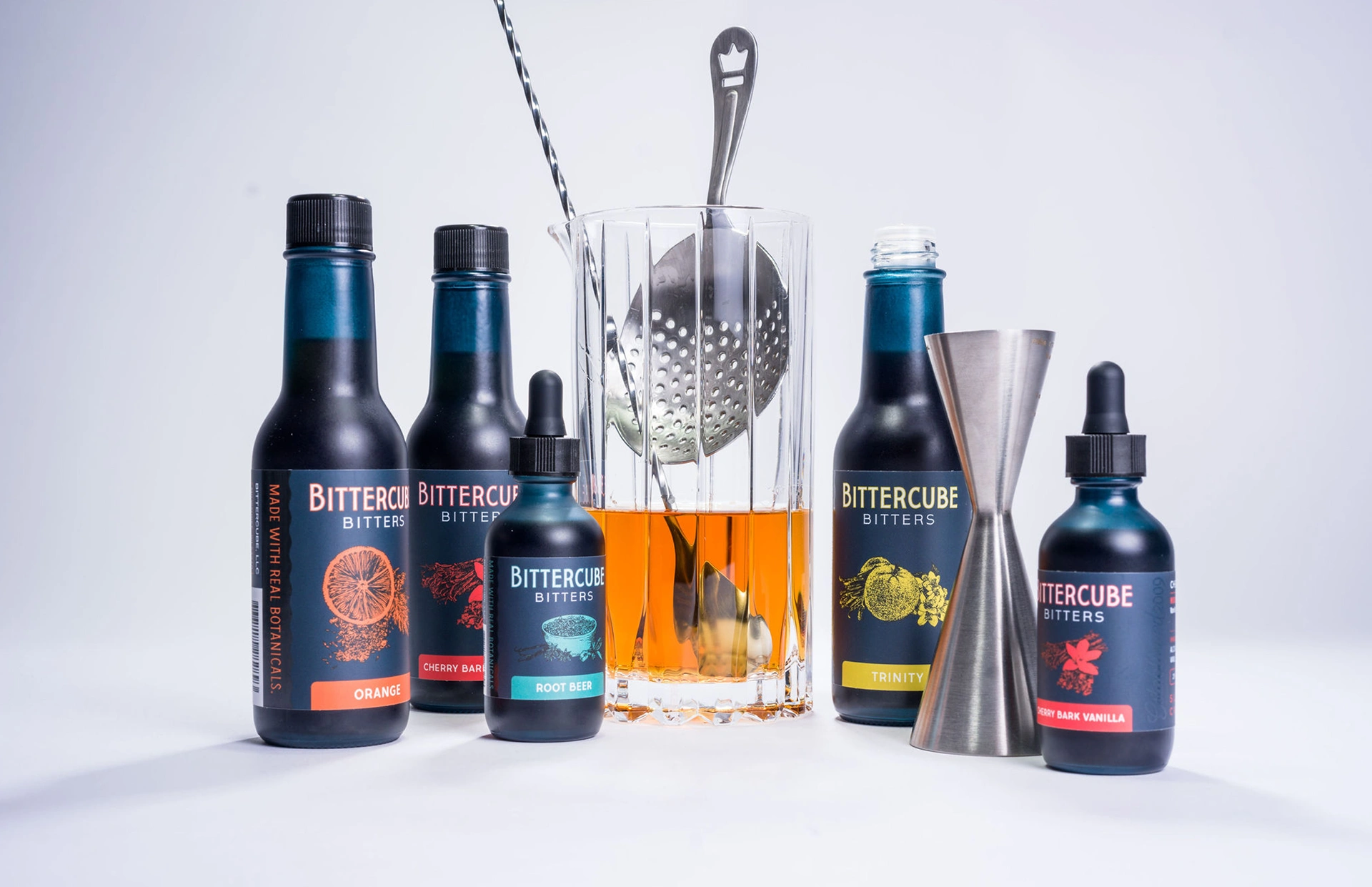
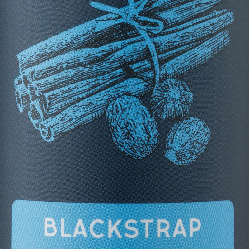
THE BEAUTY OF REAL BOTANICALS
We created these bespoke botanical illustrations with label layout in mind. Wanted to make sure it was loud and clear that there was nothing artificial to see here.


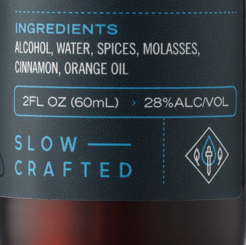
INSPIRED INGREDIENTS
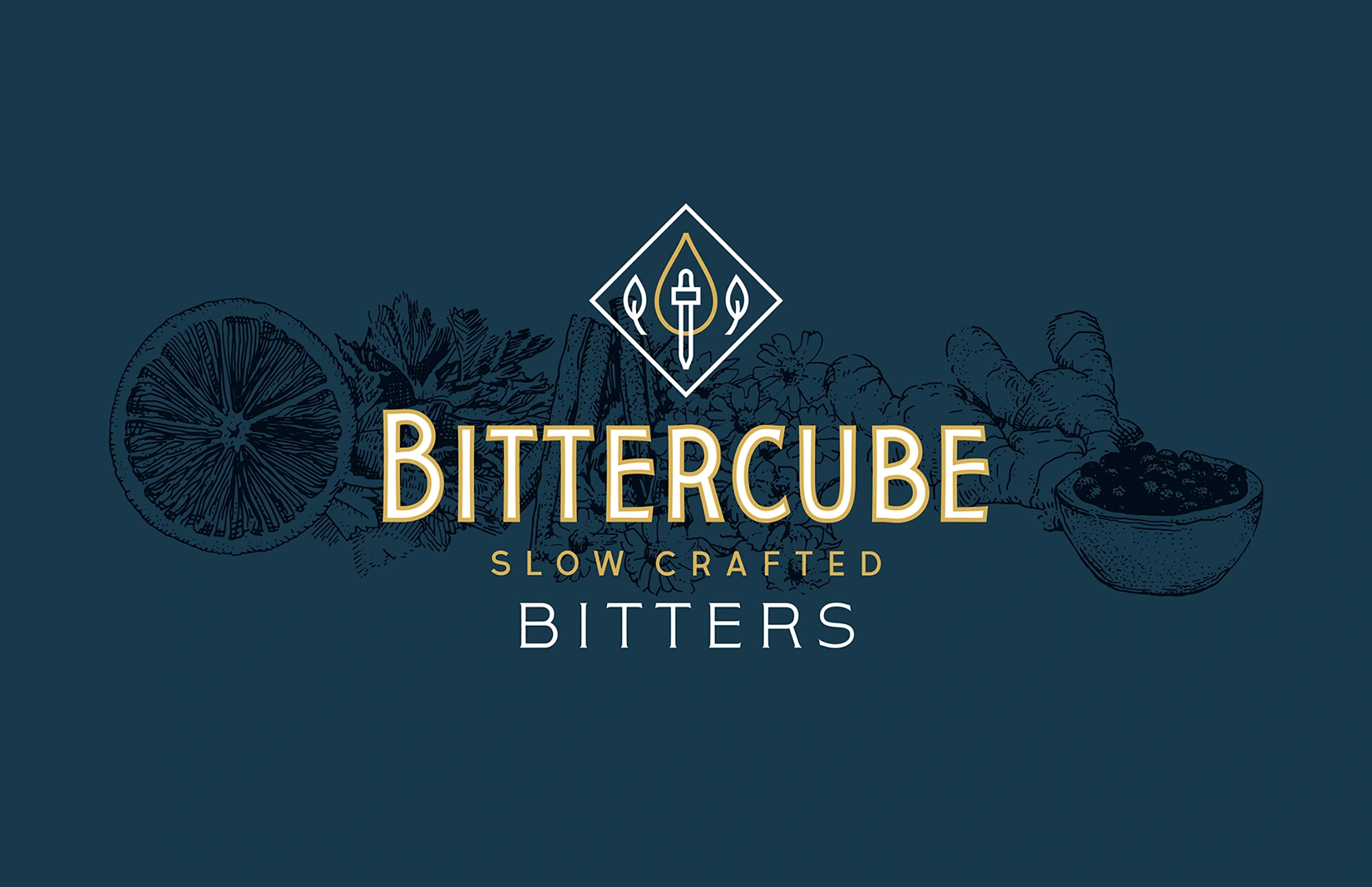
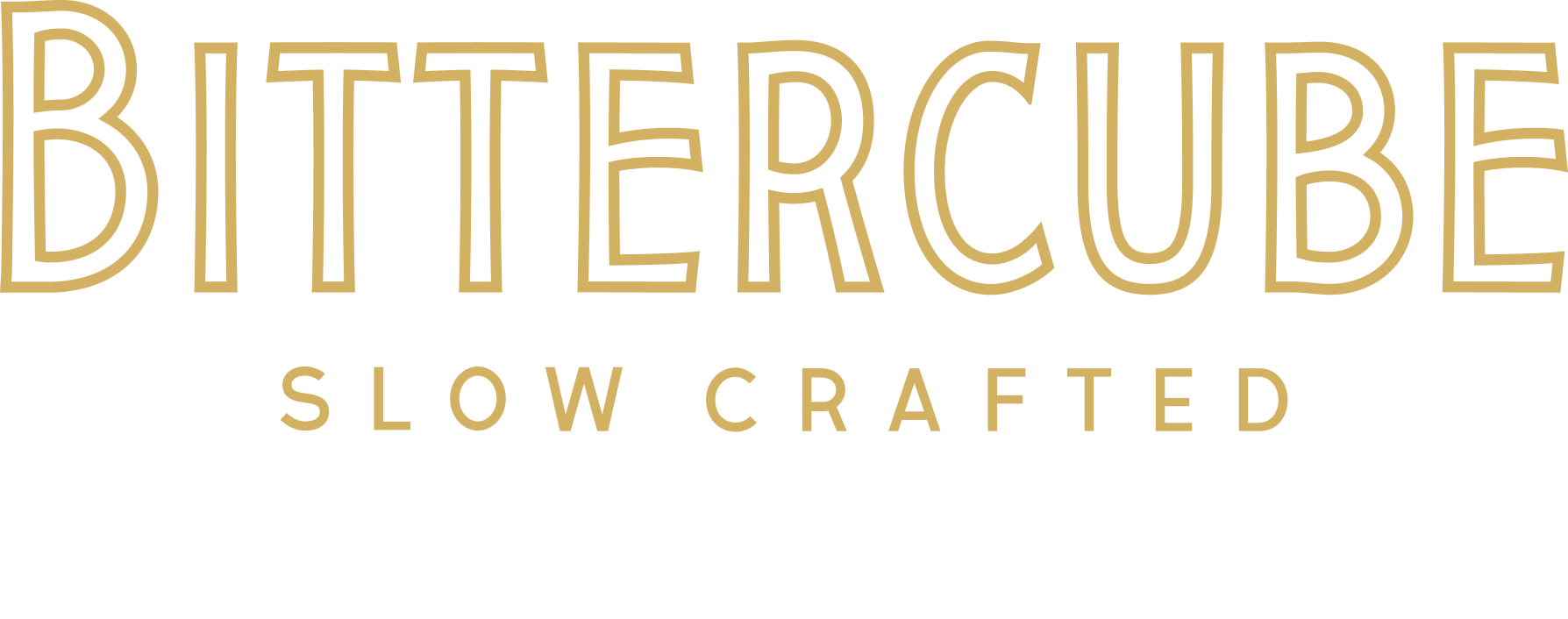
The redesigned Bittercube mark aimed to honor the brand's legacy in a way that felt fresh and forward-looking.
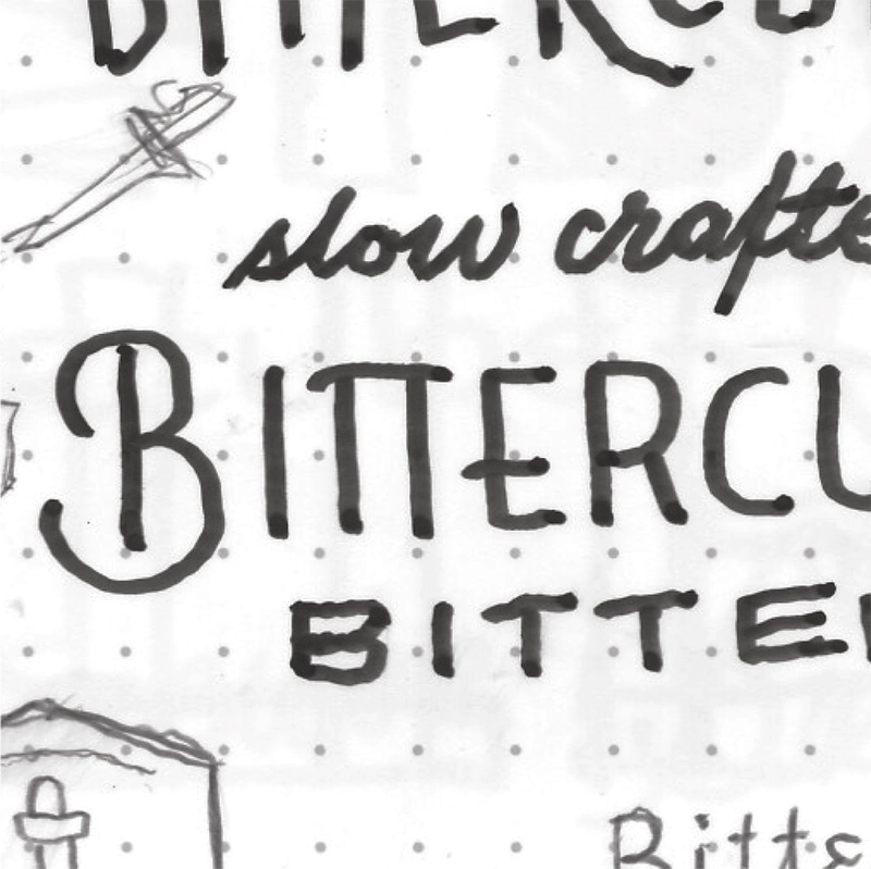
CONSIDERED COUNTERFORMS
We crafted a wordmark that befits the careful balance of flavors in every product, with the same attention to detail the Bittercube team puts to crafting the perfect Old Fashioned.
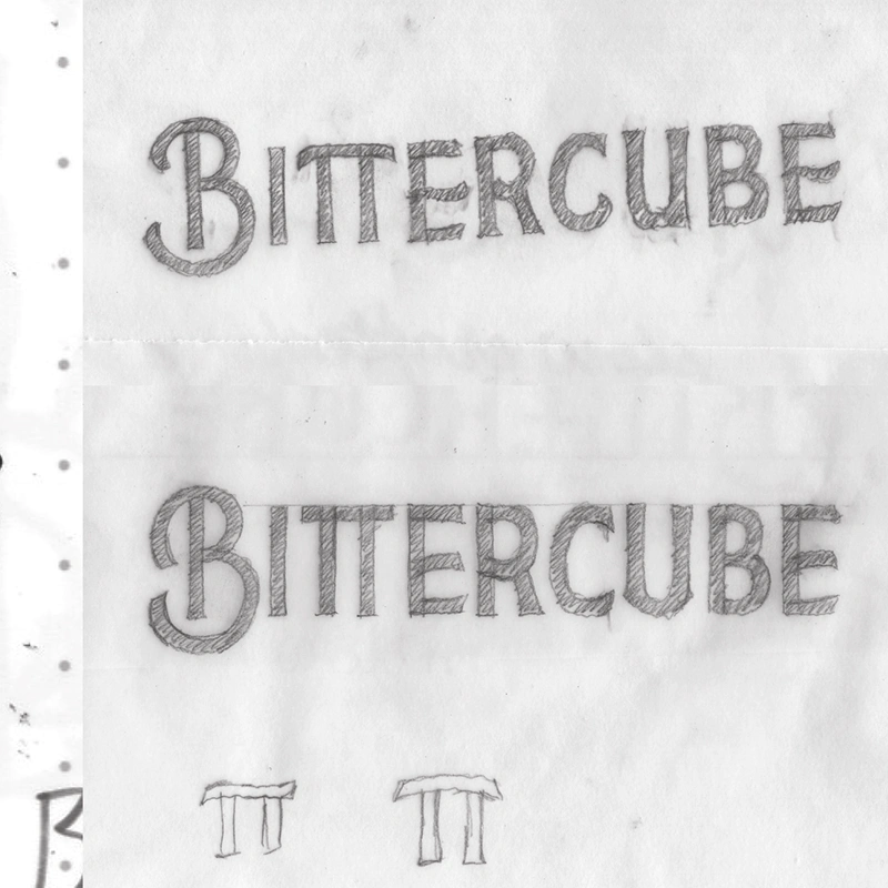


In addition to the wordmark, we drew up a custom block letter (sans-serif, for the civilians) character set for use on packaging of each bitters variety.

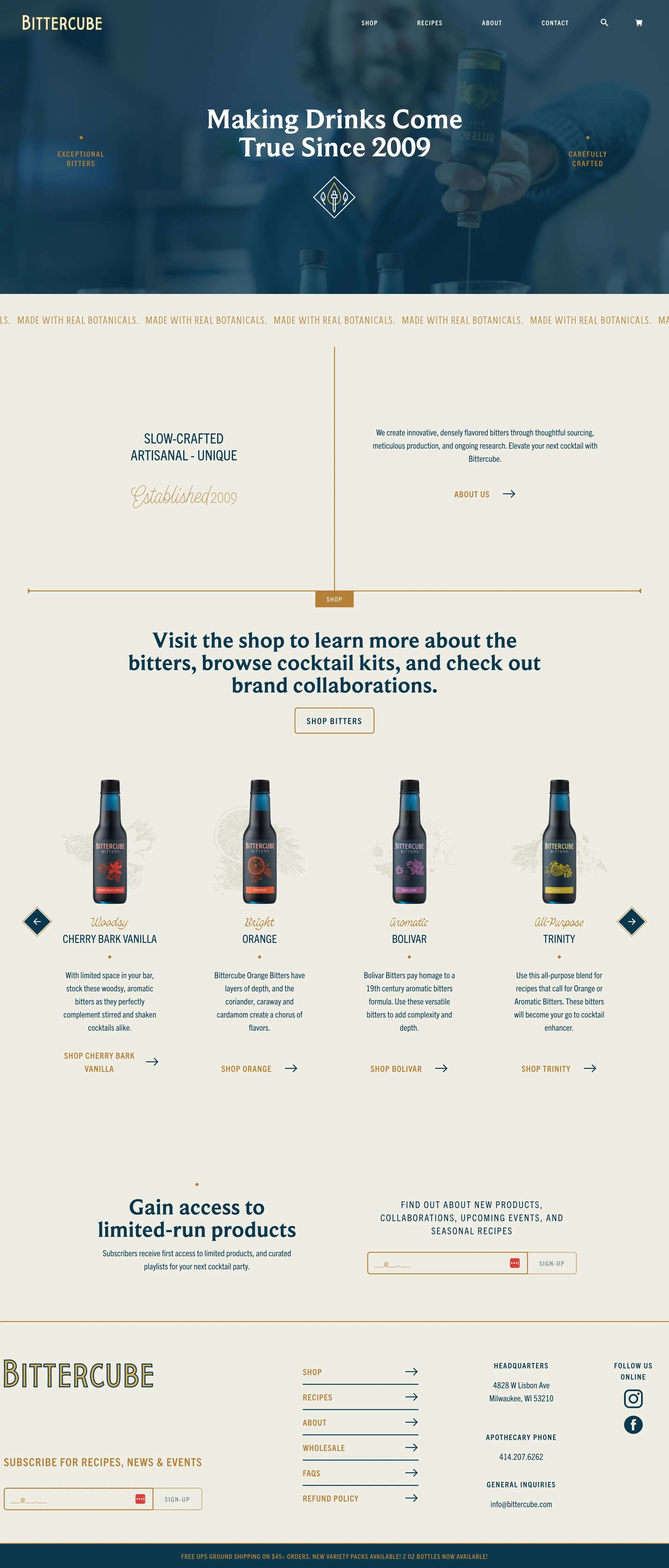
WORLDWIDE FLAVORS, MEET WORLD WIDE WEB
We built an easy-to-update Shopify e-commerce site to bring the beauty of bitters to anyone with a wi-fi connection. The site also includes a robust recipe archive where users can easily filter through hundreds of recipes by product, taste note, or ingredients.

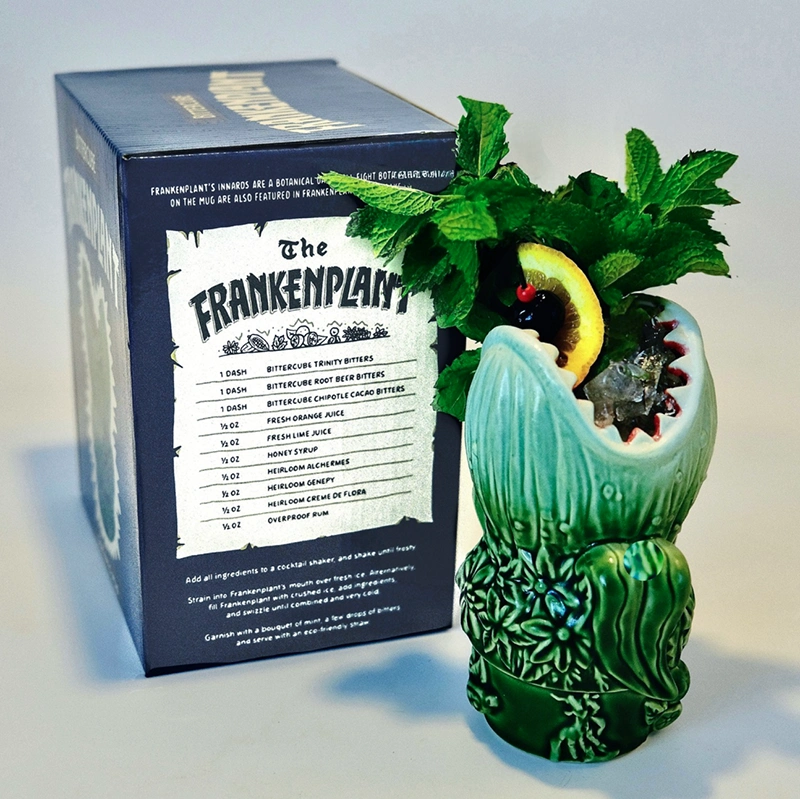
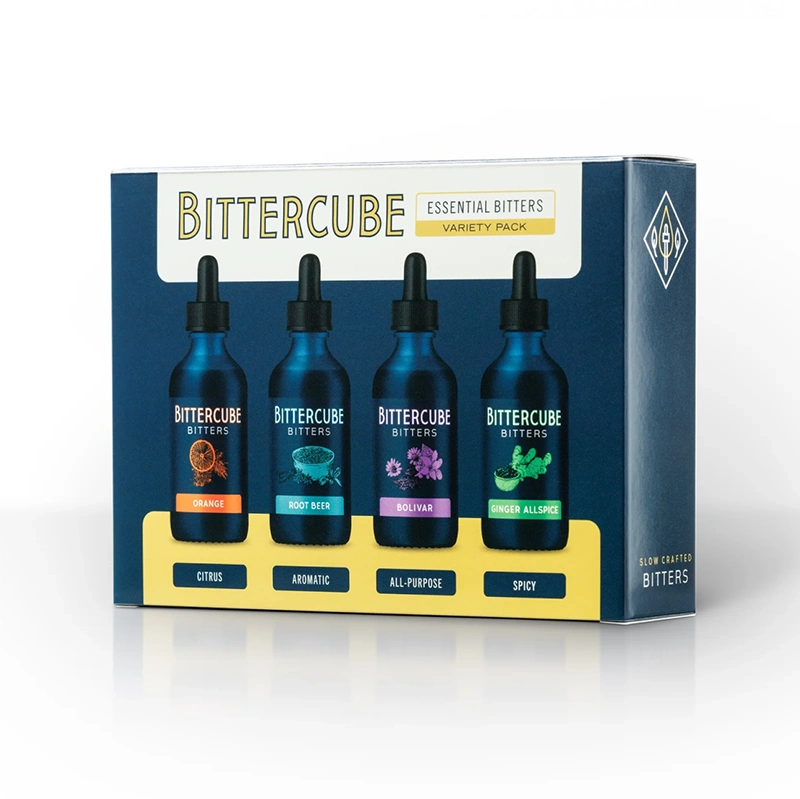
OTHER COOL PACKAGING STUFF
No, print is NOT dead. We got it all looking glorious: multi-pack boxes, frankenplant packaging, and beyond.