Visit Milwaukee case study
Visit Milwaukee
Rebrand a city that you love. No pressure amirite?
Services

Before & after
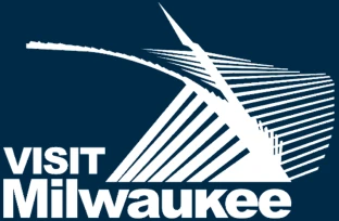
The previous approach focused on a single building, in one area of the city, which limited the ability to represent the city as a whole.

The mark
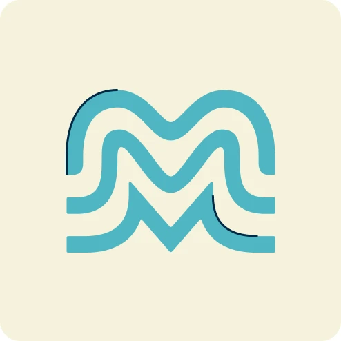
We explored an array of directions for the mark, before landing on a direction that is simple and iconic, while showcasing the unique character of this diverse city in a monogram.
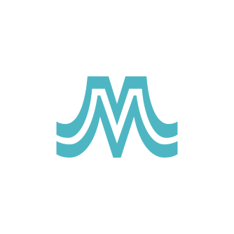
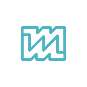


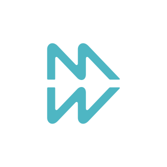
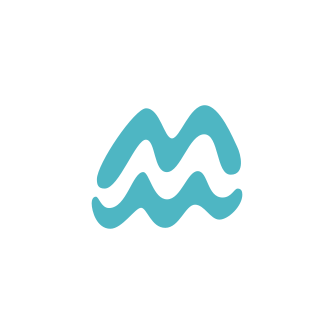

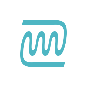
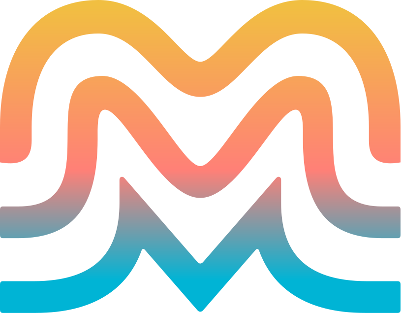
Milwaukee has layers and this mark is a representation of that diversity and unity. At its core the mark is a heart; radiating hope and rippling within our community. The organic line work speaks to our great lake coastline and confluence of three rivers.

The wordmark
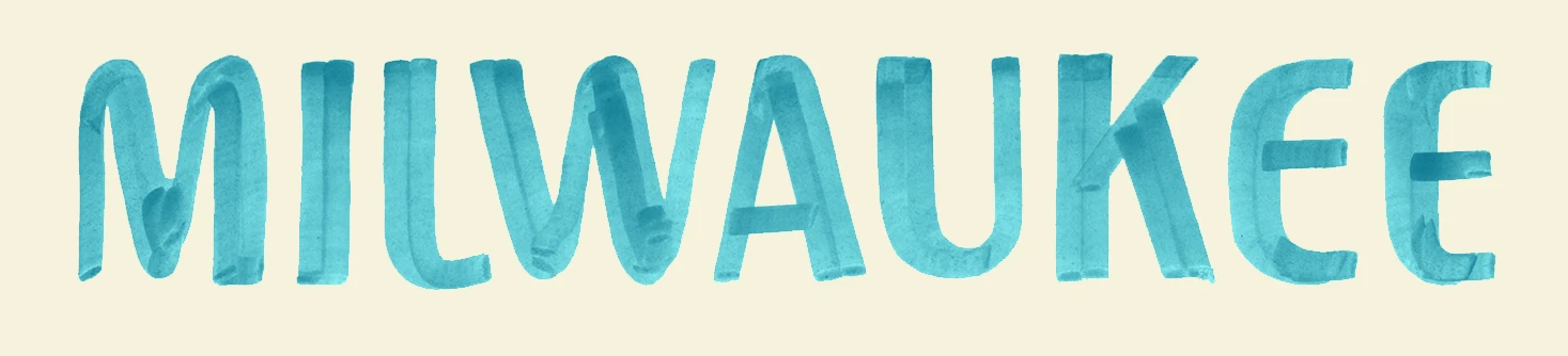
The custom lettering complements the approachability and boldness of the mark. Its inspiration is found within Milwaukee’s storied history, signage, and buildings.


Riffin’
Should the K have a gaspipe leg? Or maybe a slight curve? What if it was a standard angled leg? These are the types of questions we asked while designing the letterforms in the wordmark.
The colors
The primary color palette is comprised of a combination of River Reflection, Deep Lake, and Cream. This color system is designed to be flexible, depending on context and circumstance (e.g., brand partnerships).



Award-winning brand refresh
Visit Milwaukee won an award for the rebrand at the eTourism Summit for the eTSY Awards.
Visit Milwaukee in use
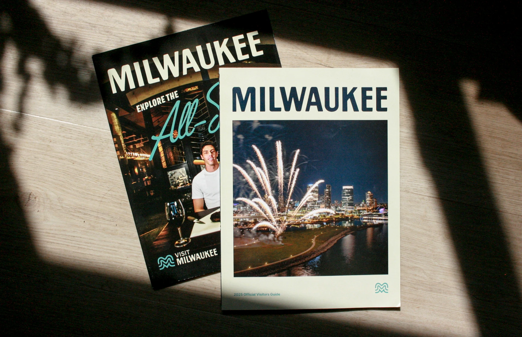
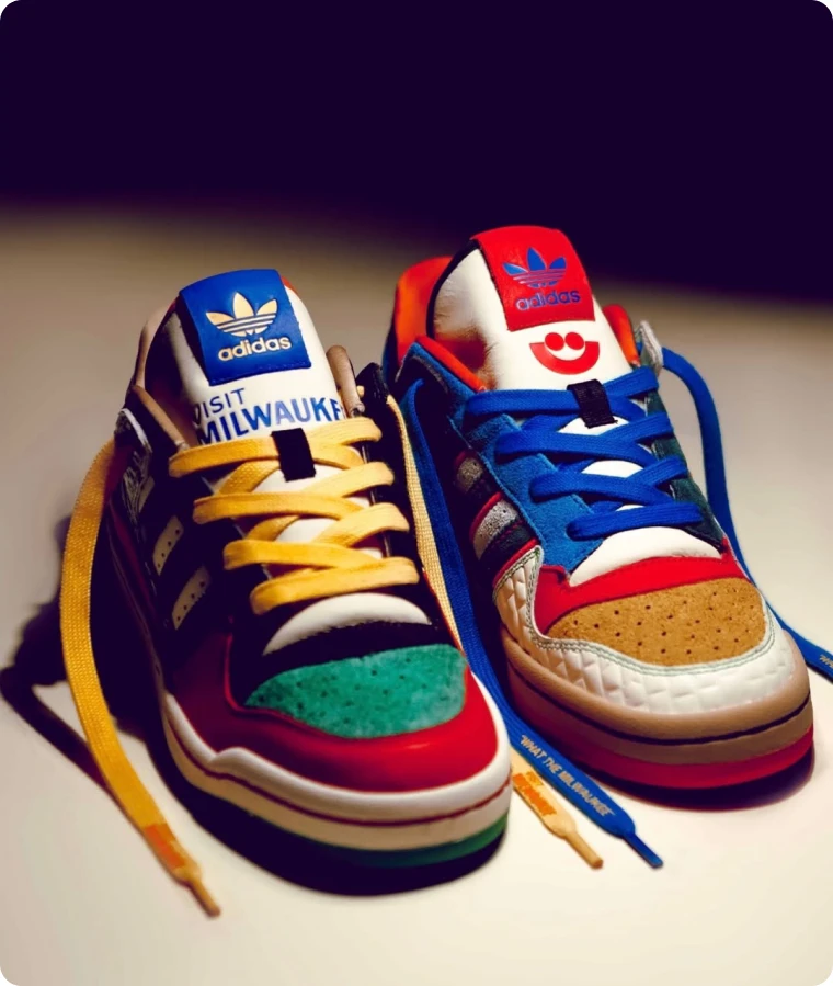
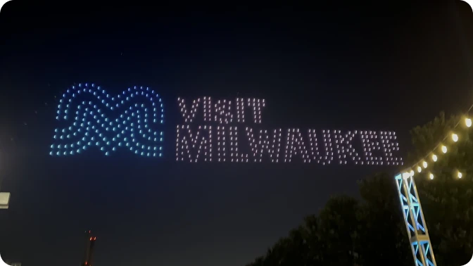
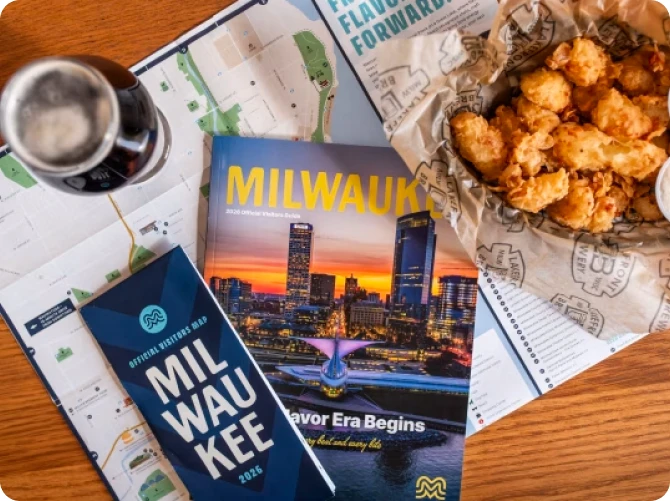
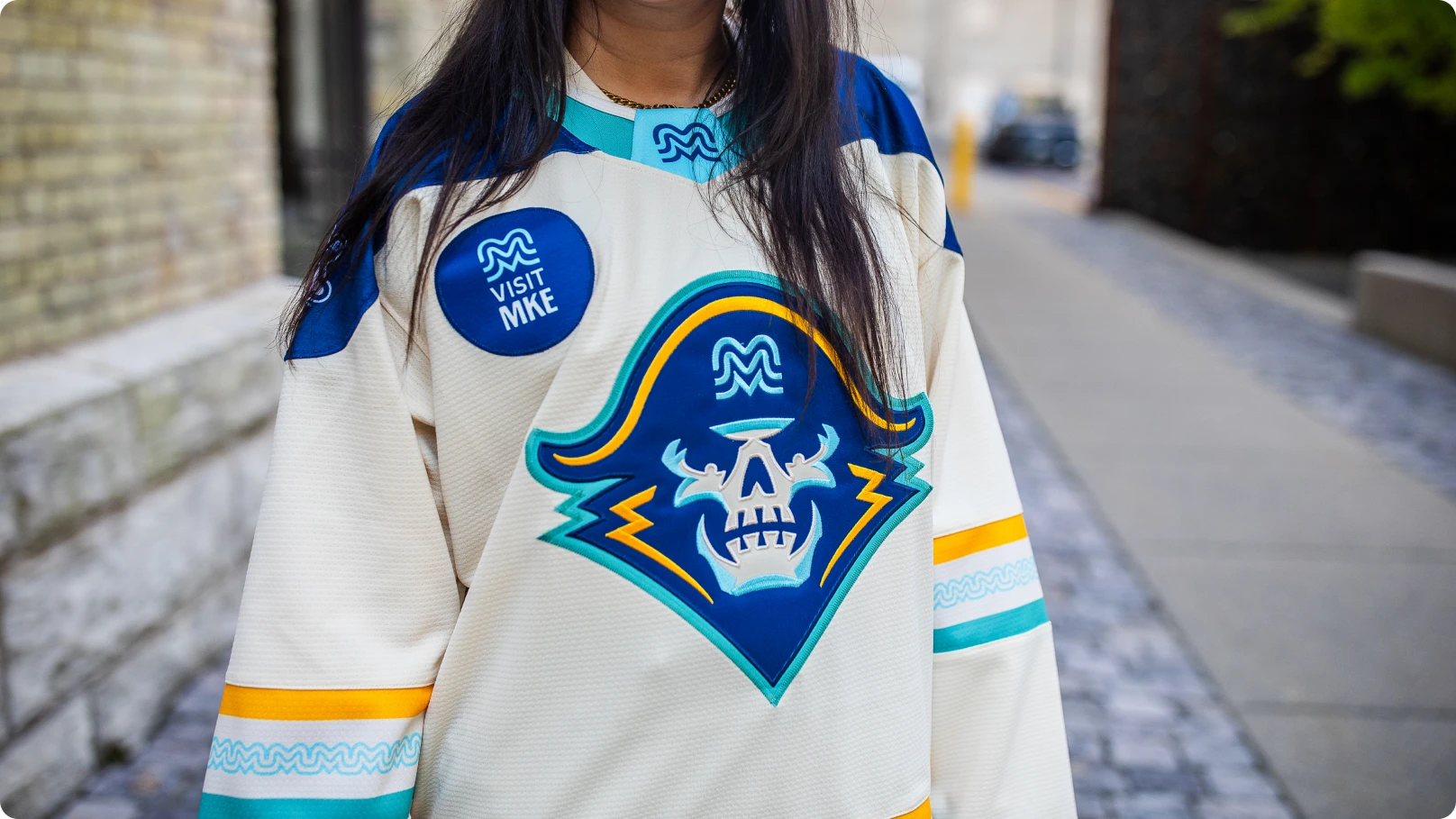
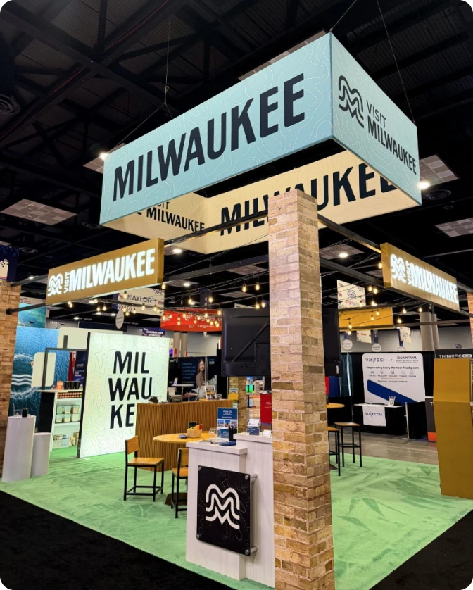
Once we handed it off, the Visit Milwaukee team took the system and ran with it. Here’s a collection of how we’ve seen the work used.
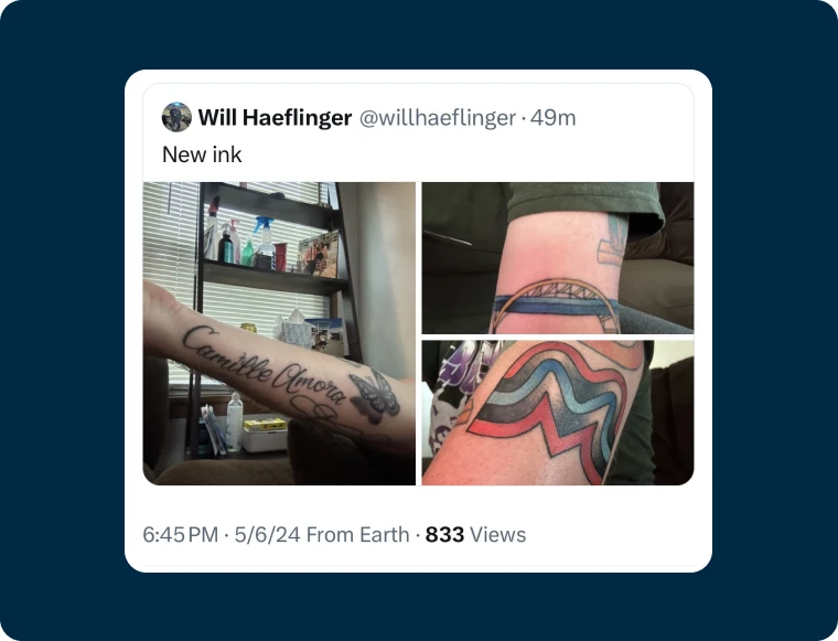
“You might also remember when Michael pitched the project, he confidently stated that the final work would be good enough for a tattoo - well, another local took that literally!
Thank you again for taking Visit Milwaukee on the branding journey. Your creativity and vision have helped make a significant positive change in our community, and we couldn't be more grateful for your partnership.”